
Improving Navigation in Web Archives
If you don’t already know what you’re looking for, it can be difficult to find your way through web archives.
Large collections created with automated tools, for example, can overwhelm visitors by requiring the entry of exact web addresses, showing huge calendars, or listing crawler seed URLs and metadata geared at experts. In short, so far, the UX (user experience) of accessing web archives has been heavily shaped by the technical parameters of capture.
In summer 2018, Webrecorder introduced the Collection Cover page, which allows collection owners to describe their materials and present lists of curated entry points that may guide visitors through a web collection.
Today’s Webrecorder release presents further improvements for navigating and organizing collections for both visitors and collection owners.
Links Up Front For Visitors
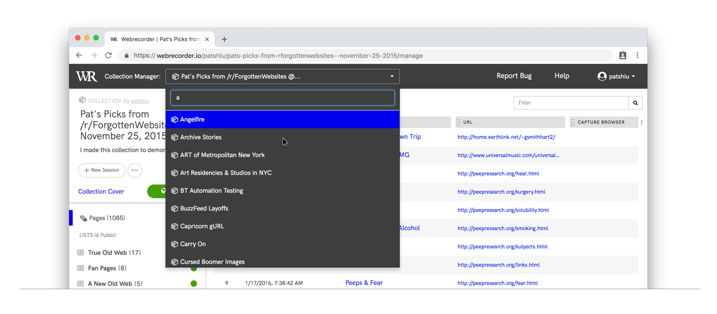
The new Collection Cover page allows collection owners to present a guided take on a collection, and call attention to specific points of interest within the collection. Lists, pages and their accompanying descriptive text, are now incorporated into a single view designed for readability.
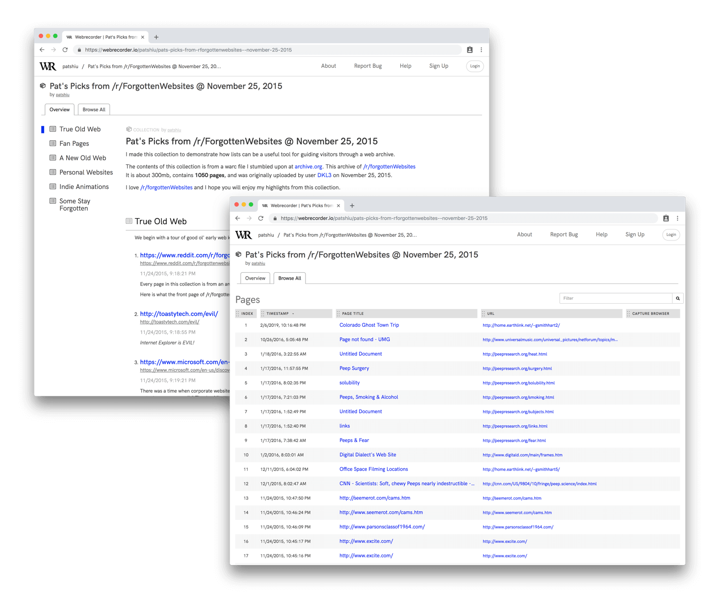
The tabular page index view, for a more comprehensive view of collection contents, remains available to visitors via the “Browse All” tab, so long as the collection owner has set the collection’s page index to public.
Providing context via descriptions and organizing content into thematic lists can help visitors make sense of the captured materials, particularly in the case of collections that span several web sites, services, and platforms.
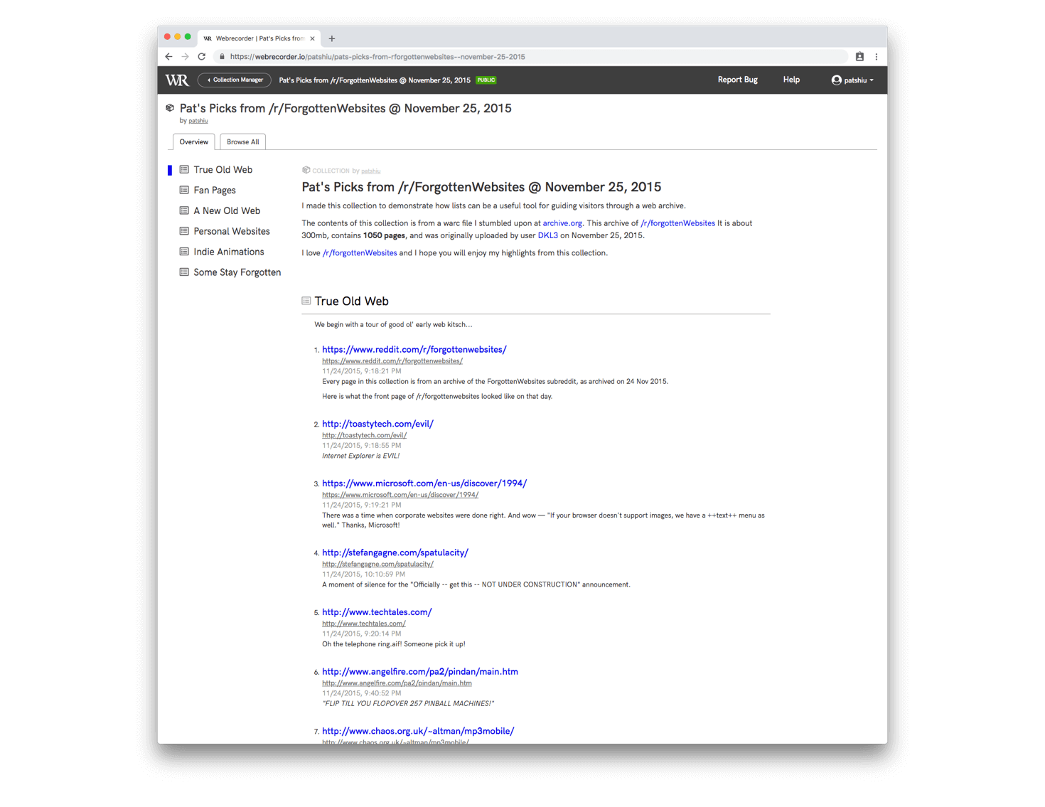
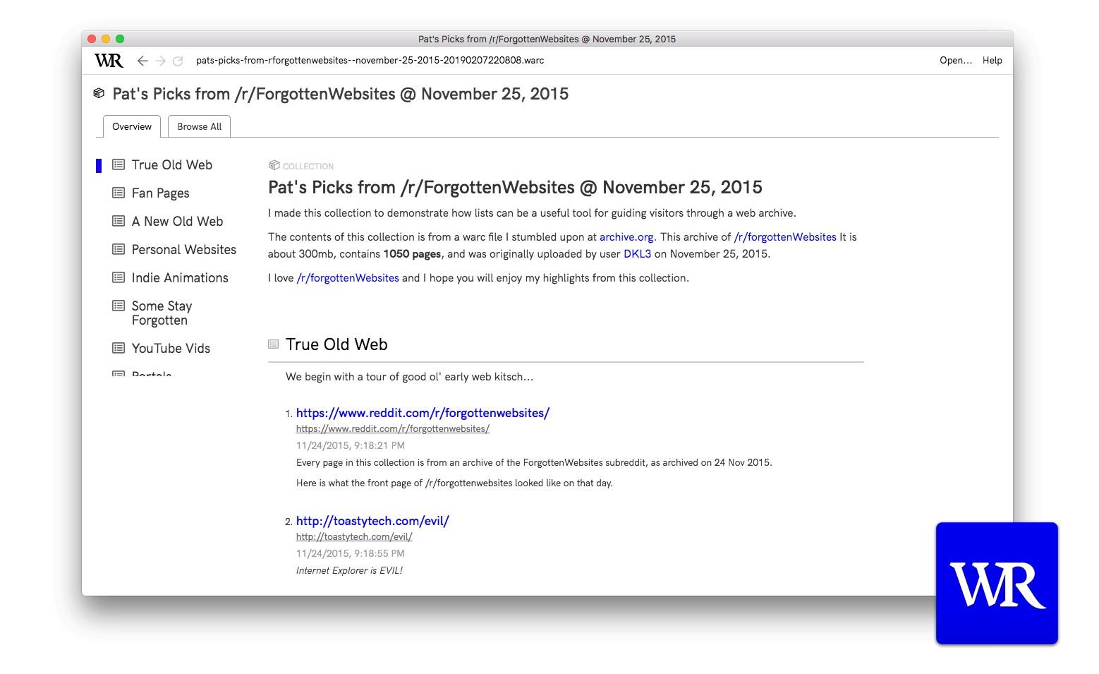
We’ve created some example collections to demonstrate the Collection Cover’s capabilities. Here is a melancholy collection by Dragan, about people abandoning the Trance lifestyle by selling their Dream Dance CDs online. And here’s another, created by our designer Pat Shiu, that walks visitors through a found WARC of a 2015 archive of /r/forgottenWebsites. Please let us know if you created a collection that makes good use of lists via support@webrecorder.io!
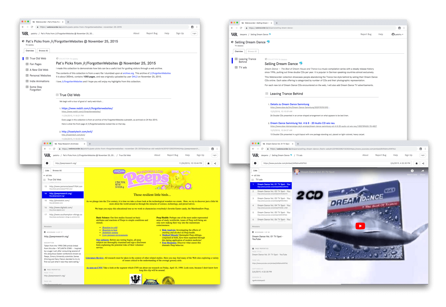 Left: Pat’s Picks from /r/forgottenWebsites @ 25 Nov 2015
Right: Selling Dream Dance
Dedicated Views for Collection Management vs. Presentation
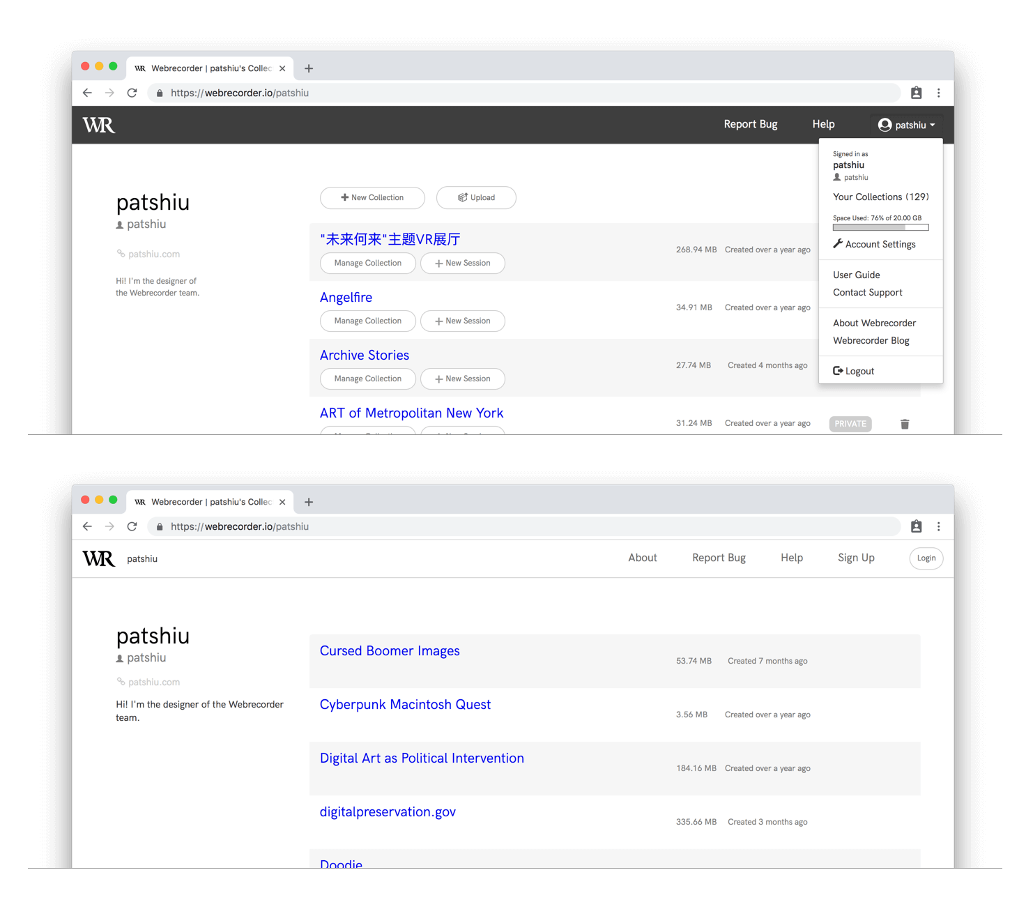
A dark top bar clearly signals users that they’re viewing one of their own collections.
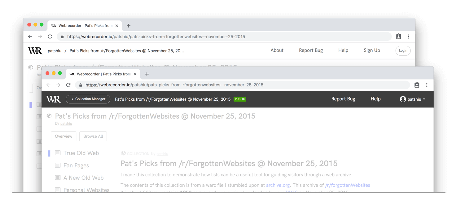
It provides a new button to bring up the collection manager, removing previous ambiguity caused by the breadcrumb navigation, and a quick way to switch in between collections.
The title of collections on the Users’ Collections page now lead to the Collection Cover page. The buttons below will only be visible to collection owners. The user menu introduced at the top right shows a storage usage graph and provides easy access to account management and help pages.
Webrecorder Player
The new Collection Cover is also available in the latest release of our desktop Webrecorder Player(1.6.3) app. Downloaded webrecorder collections can be browsed offline, with the same Cover Page presentation, in the desktop app.
Webrecorder Community
A huge thank you goes out to all testers that gave our new user interface a spin and provided in-depth feedback! You help us shape comprehensible and usable features out of the UX challenges we face.
Lisa Barrier, Sumitra Duncan, Kathryn Gronsbell, Anisa Hawes, Stephen Klein, Genevieve Milliken, Jasmine Mulliken, Samantha Norling, Jean Park, Andrea Puccio, Coral Salomon, Mike Satalof, Lydia Spotts: we’re grateful for your time and insights.
If you would like to contribute in the next round of testing, let us know via support@webrecorder.io.
Watch out for the our next blog post, a report on Webrecorder’s first community call which took place January 29.